Renovations
Caribbean Dream – A Whole Home Renovation In Surrey
A home should reflect its inhabitants. It seems that home design is becoming more and more impersonal – clients want their home to look like the images they see online or in magazines, but maybe that isn’t the best objective when it comes to design? We feel that a home should be a collection of the possessions our clients love, and a true reflection of their personality – quirks and all. The owners of this project were some of the most fun, bubbly and jocular clients we’ve ever had the pleasure of working with, and their home shows it.
Read more to learn about this whole home renovation.
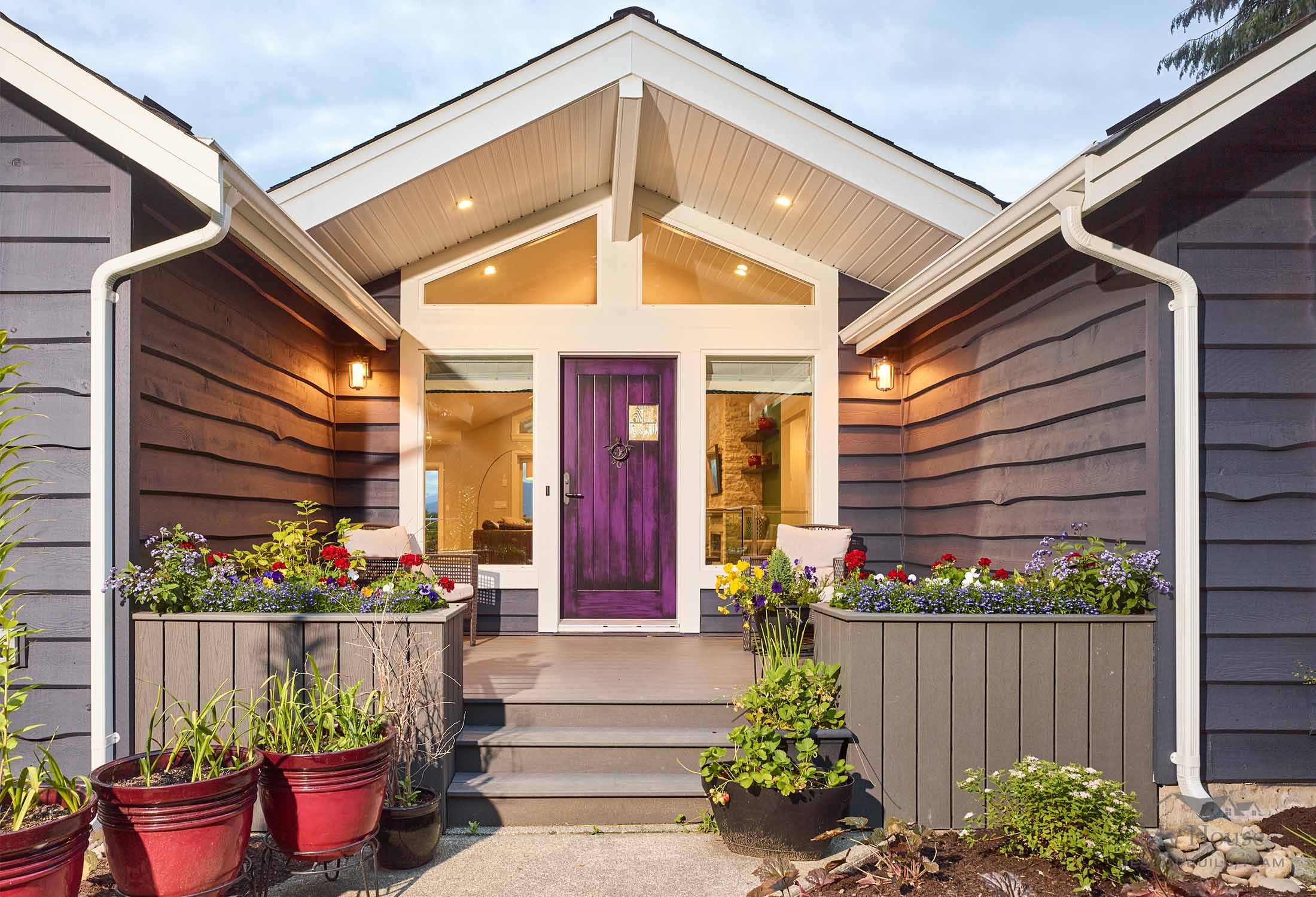
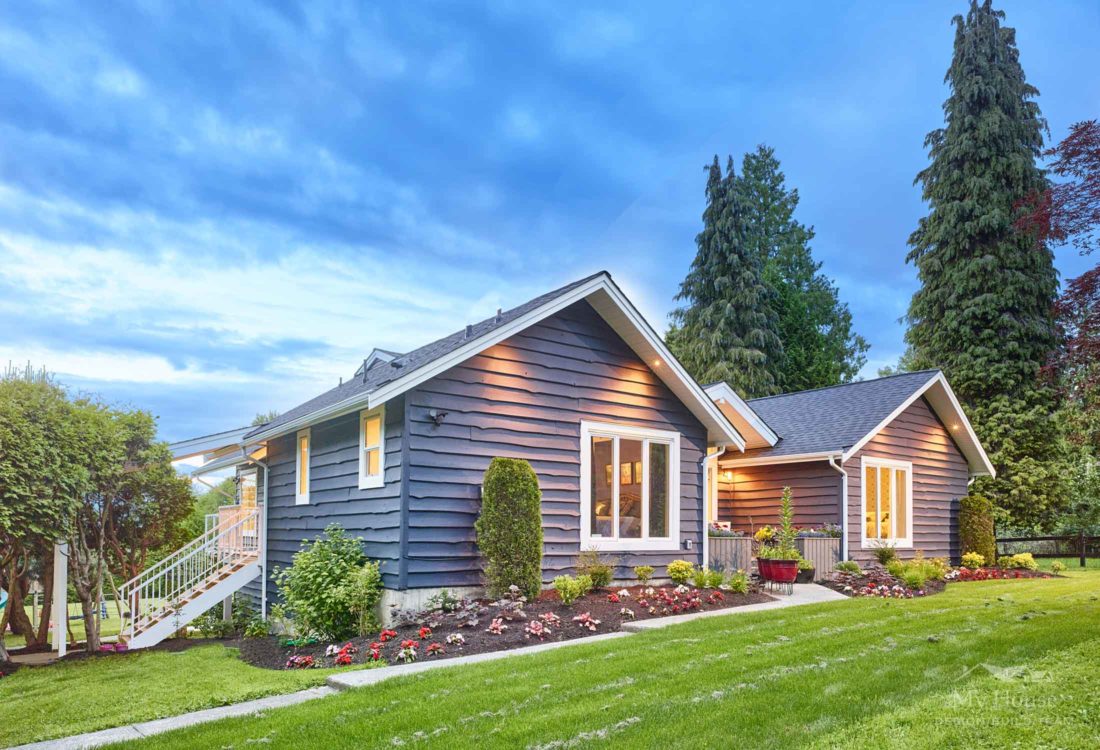
This home is situated in a more rural area of Surrey, on a nice parcel of land – big enough for free range children and goats. The family purchased this home because the location and land offered everything they were looking for, even if the house didn’t suit their needs or their style. Enter My House Design Build.
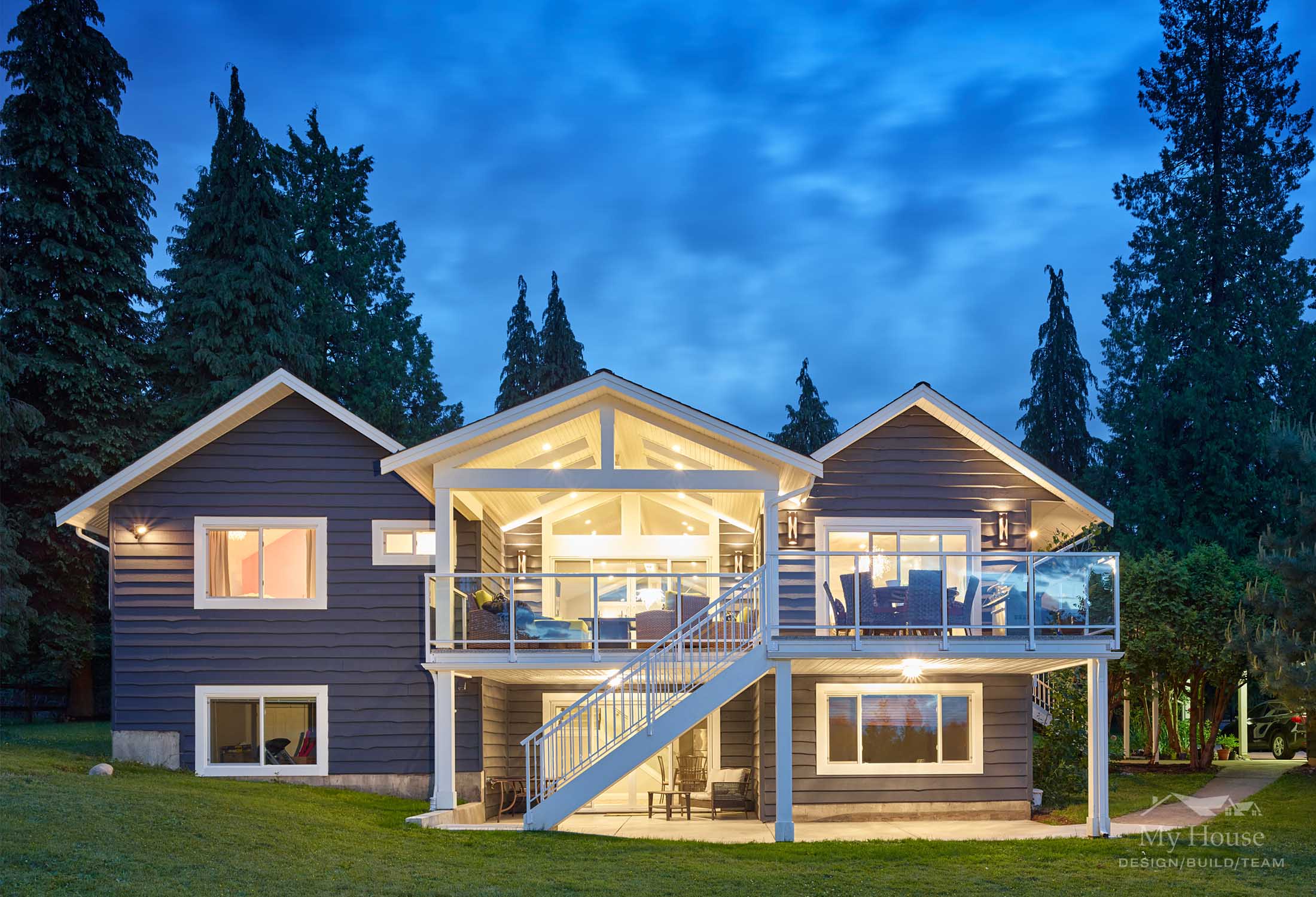
As with all our projects, we started with the architectural design. The house was large enough, but it lacked function and openness. There were only 2 bedrooms on the main floor and two sets of stairs into the basement (who was their designer?!). Pair that with some questionable rock feature walls, and we had to look at this home from the perspective of a complete gut. The first step was to plan for a single staircase to the basement in a location that made sense. Once we removed the wall that separated the foyer from the living room, we created a nice open space as you enter the home, and the perfect location for the set of stairs. No rock was salvaged in the making of this space. Additionally, with the centrally located living room and vaulted ceiling, it provided the perfect opportunity to expand the deck space out back and create an amazing covered area with views to the mountains beyond.
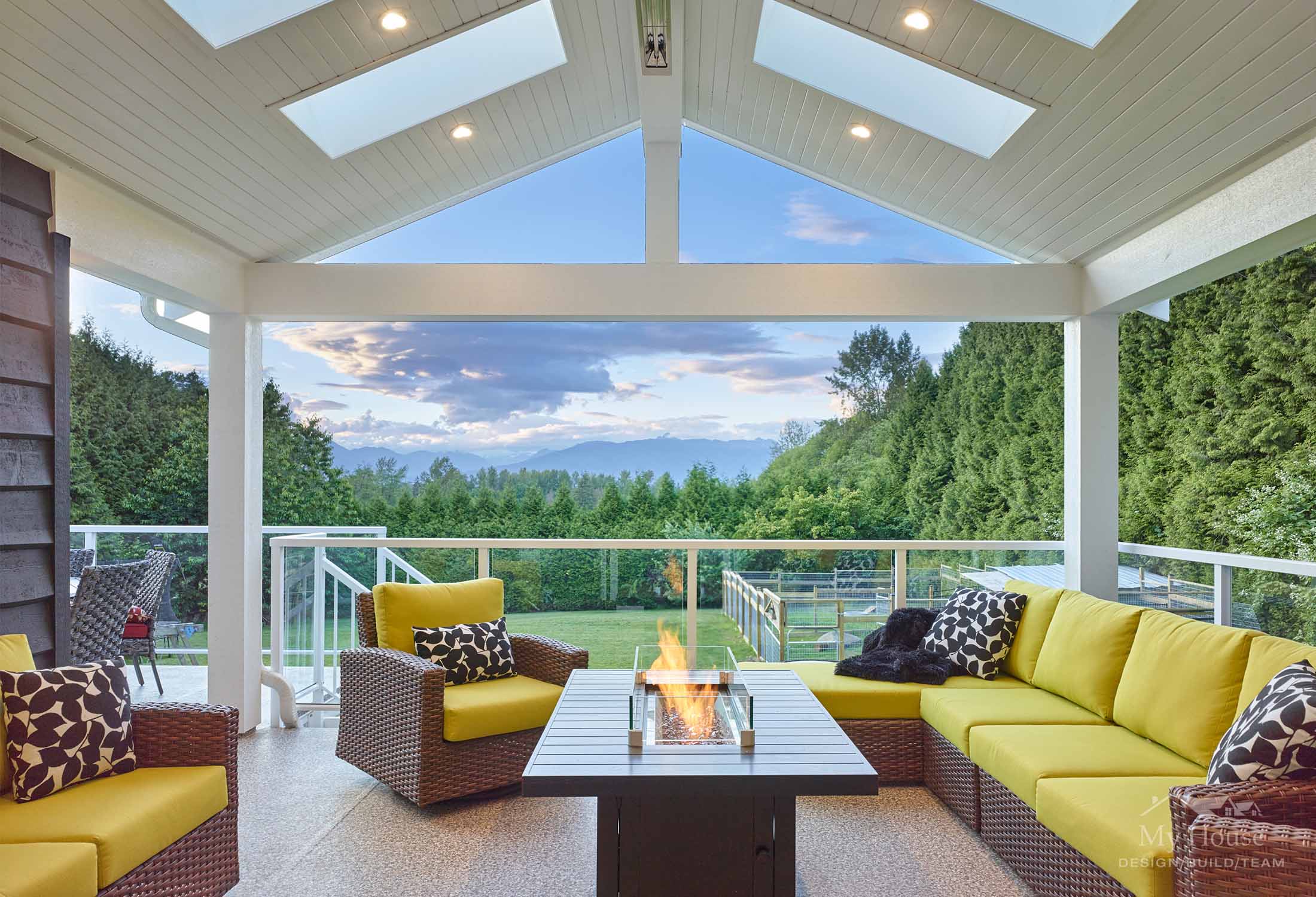
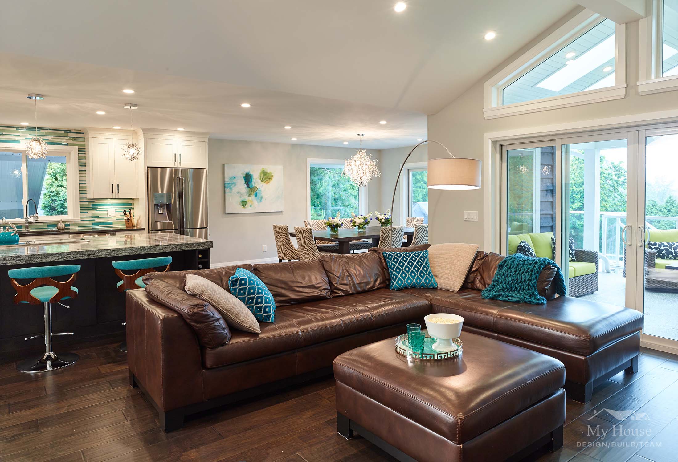
With a family of four, the clients understandably wanted all children sleeping on the same floor. So, we stole the formal dining room to create the third bedroom, removed the wall separating the kitchen and the living room, and placed the new dining room at the back of the house. This also allowed a great room concept and a nice open kitchen space. Plus, have I mentioned the view?
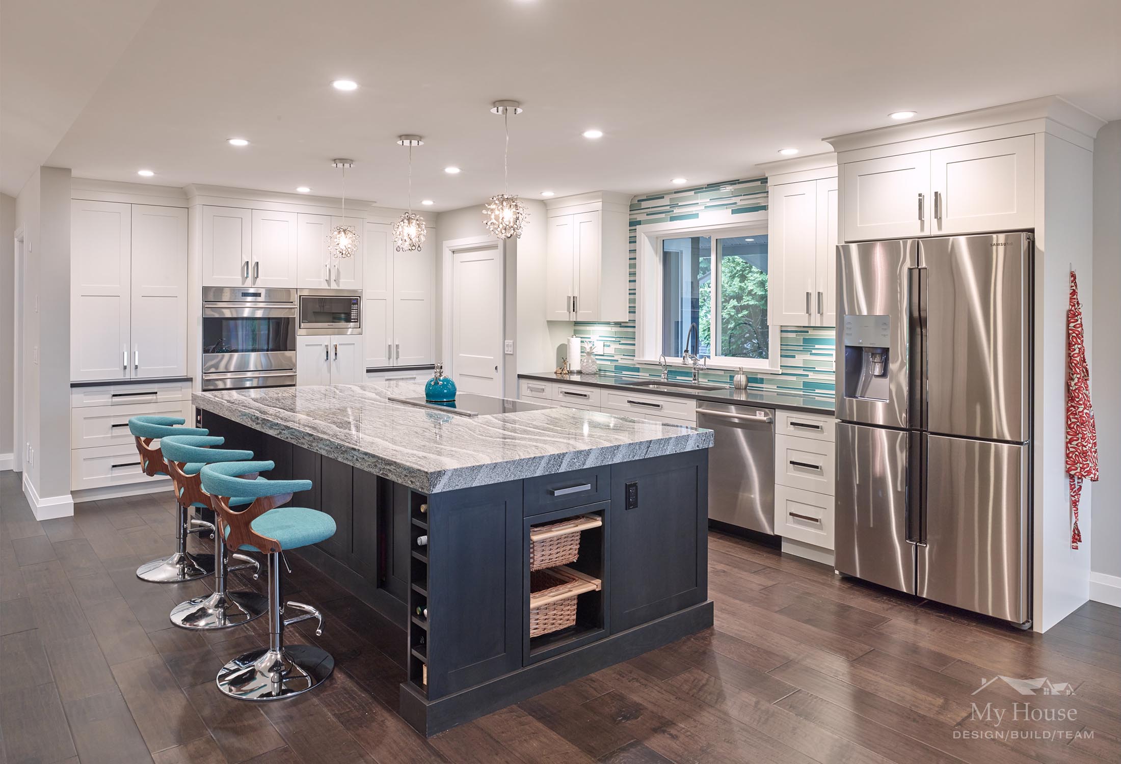
One of the primary objectives of this renovation was to create an amazing kitchen space with lots of function and storage. We have a bright white custom kitchen, with 2 bi-fold appliance garages, double ovens, and a family sized fridge. The island is stained a peppercorn colour and houses an induction cooktop, downdraft vent, 2 spice pullouts, a mixer lift, and of course plenty of wine storage. Top it all off with a 3” mitered edge Camrbia counter top and a turquoise glass mosaic stile splash, and you have a dynamic and interesting space.
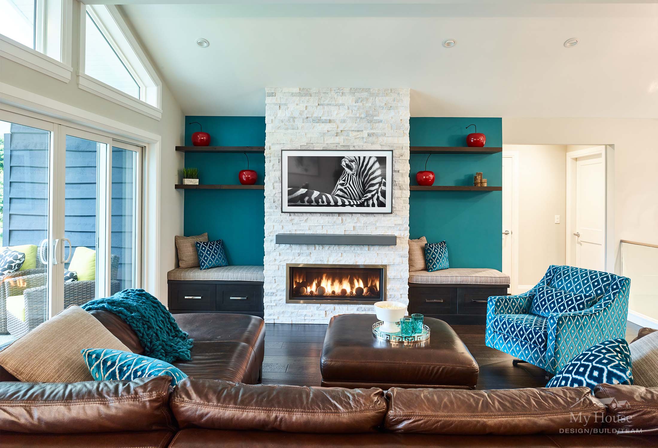
So, about that blue! I know you’re all wondering… Our clients told us that some of their most fond memories are from being on vacation in the Caribbean. That azure sea and pure white sand – they wanted to recreate the feel in their home. Bold colour is an excellent choice when clients LOVE it. It has to be a colour that they will never tire of, and in this case, it gives the space character and pop, and definitely makes it more fun than… white, grey and sparkles.
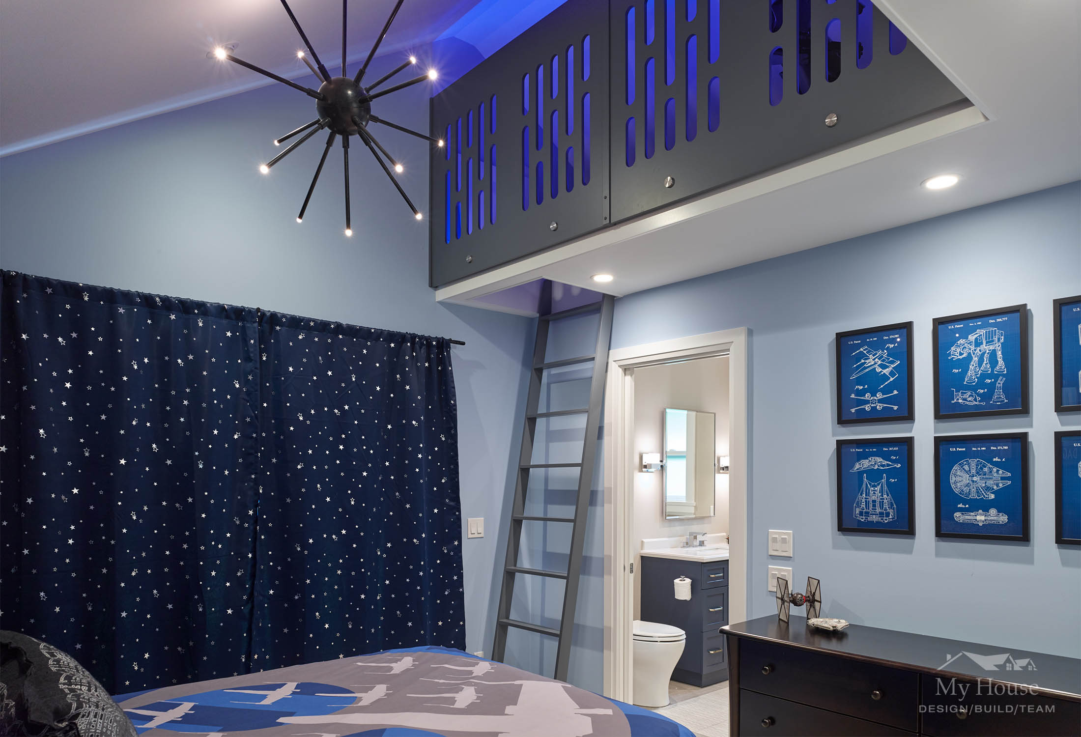
The second major objective was to give the kids amazing spaces of their own. First thing was first – we created loft spaces for each of them. The daughter’s room already have a vaulted ceiling, which we took total advantage of, but the son’s room ceiling was originally flat. To keep things fair, we reframed the ceiling over the son’s room so that he could also have a loft space. Designing the children’s rooms was one of the most fun aspects of this job. After harrowing interviews with the 6-year olds’, complete with harsh lighting and a definite “bad cop”, we plucked from their brains all the elements they love and desire.
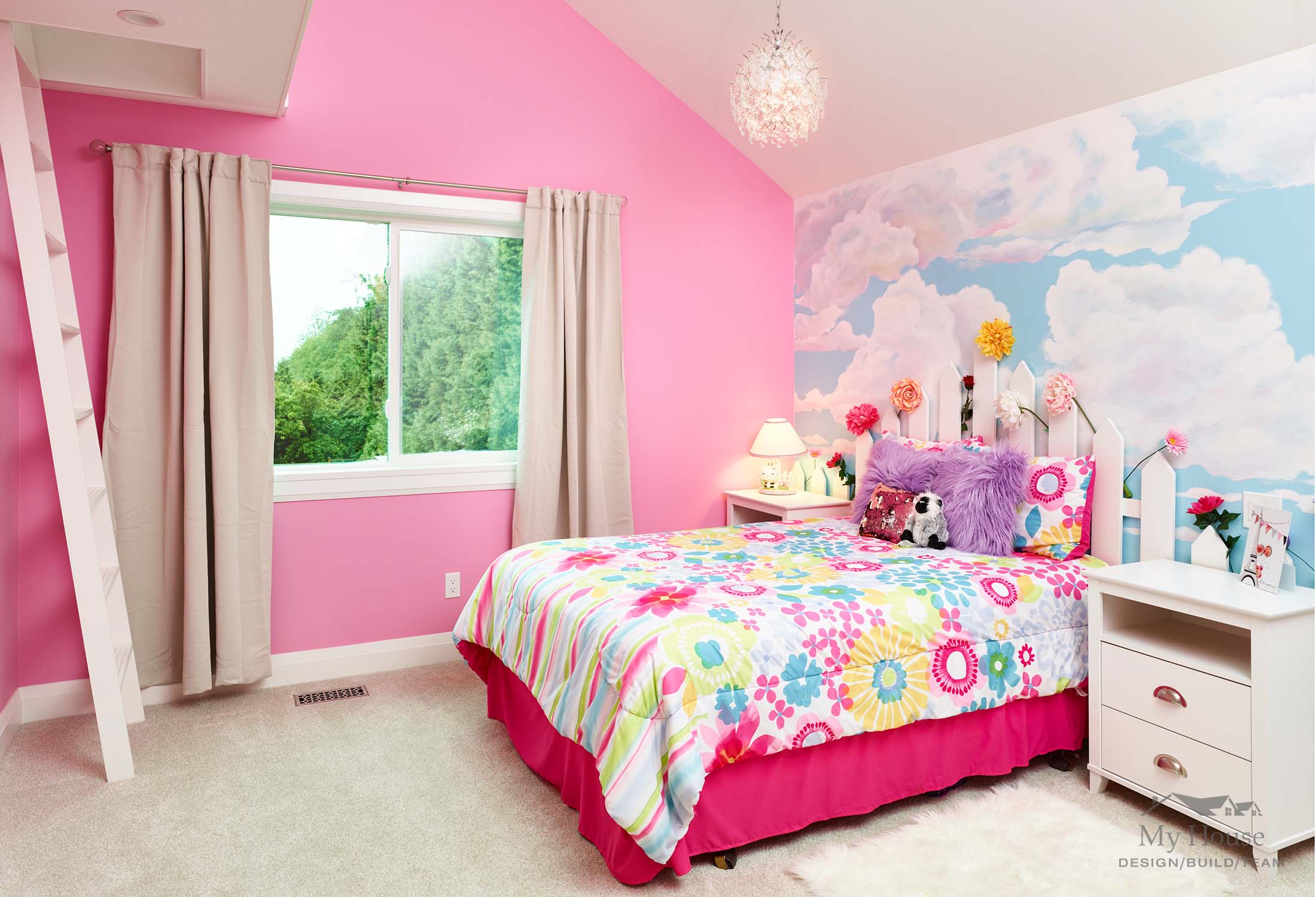
A Garden Party theme was created for the daughter, including crystal chandeliers, and a picket fence headboard wall and loft guard-rail. We topped it all off with a custom painted wall mural and light up flowers to accessorize. And, of course… pink! The son was crazy about Star Wars so we got to hardcore geek out and design the colour palate for his room to match R2D2, and loft guard rails that are replicas of the light panels on the Death Star. This railing is back lit with a colour changing LED strip light, and the light over his bed definitely looks like something from another world condo for sale san diego downtown. We hunted for Star Wars accessories and found travel posters, blueprints, bedding and even the closet door Death Star knobs.
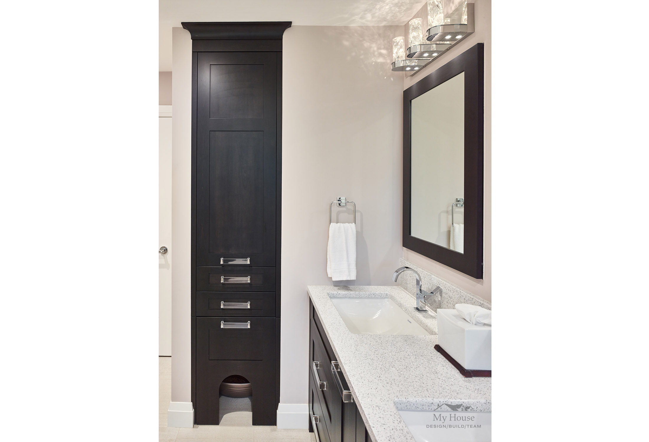
The cats were nearly as important as the children. We created for them a private potty sanctuary in the bottom of the linen tower in the ensuite, heated the esuite floors so their bellies don’t get cold and created a frameless glass cat door (NOT a baby gate…) to keep them from adventuring in the basement. They have been pretty good about sharing their space with Mom and Dad, and even allow them to shower occasionally in the luxuriously large walk in shower.
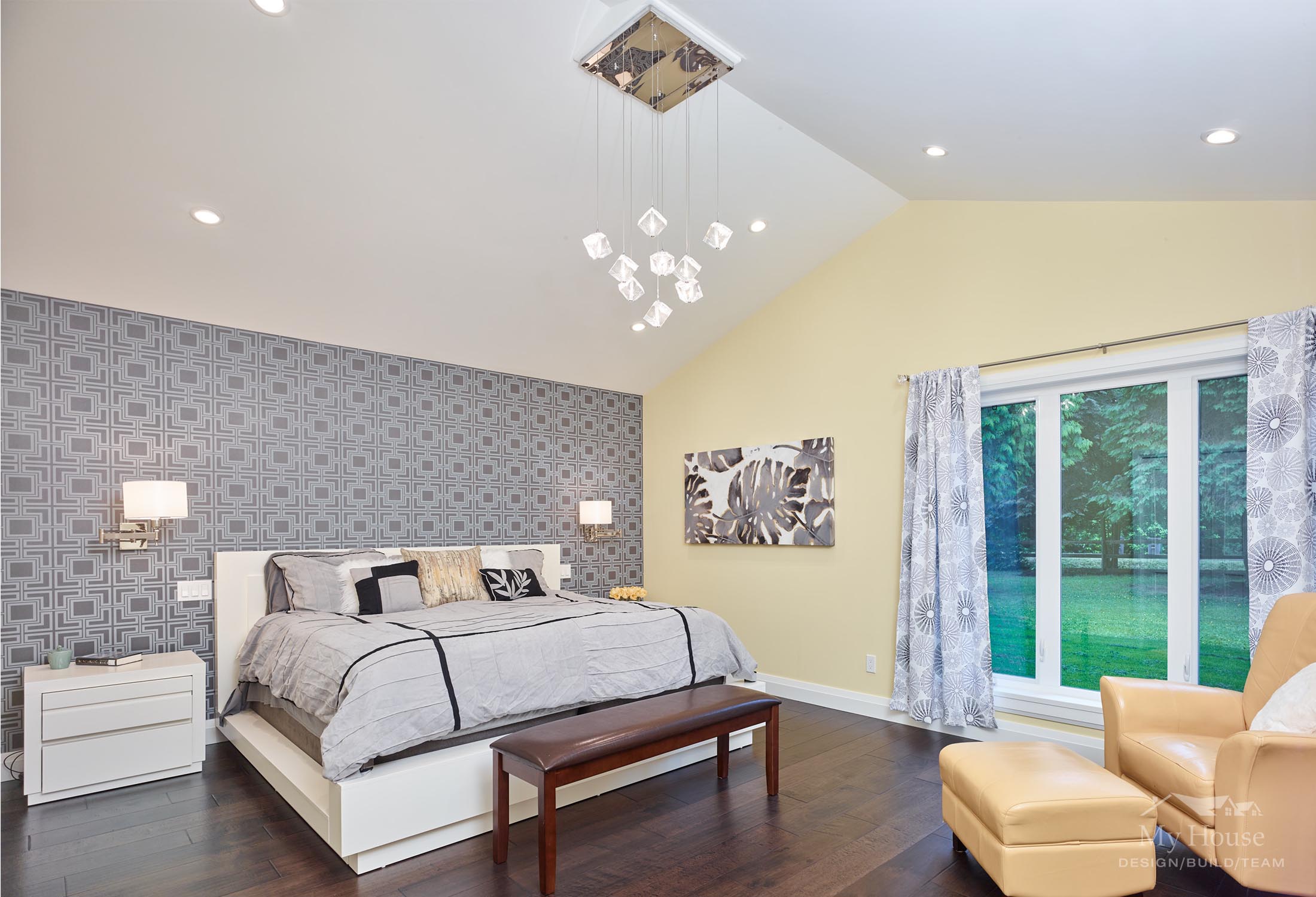
The master suite is a cheery sanctuary with the favourite leather chair, and an impressive closet for her. His closet is nothing to write home about.
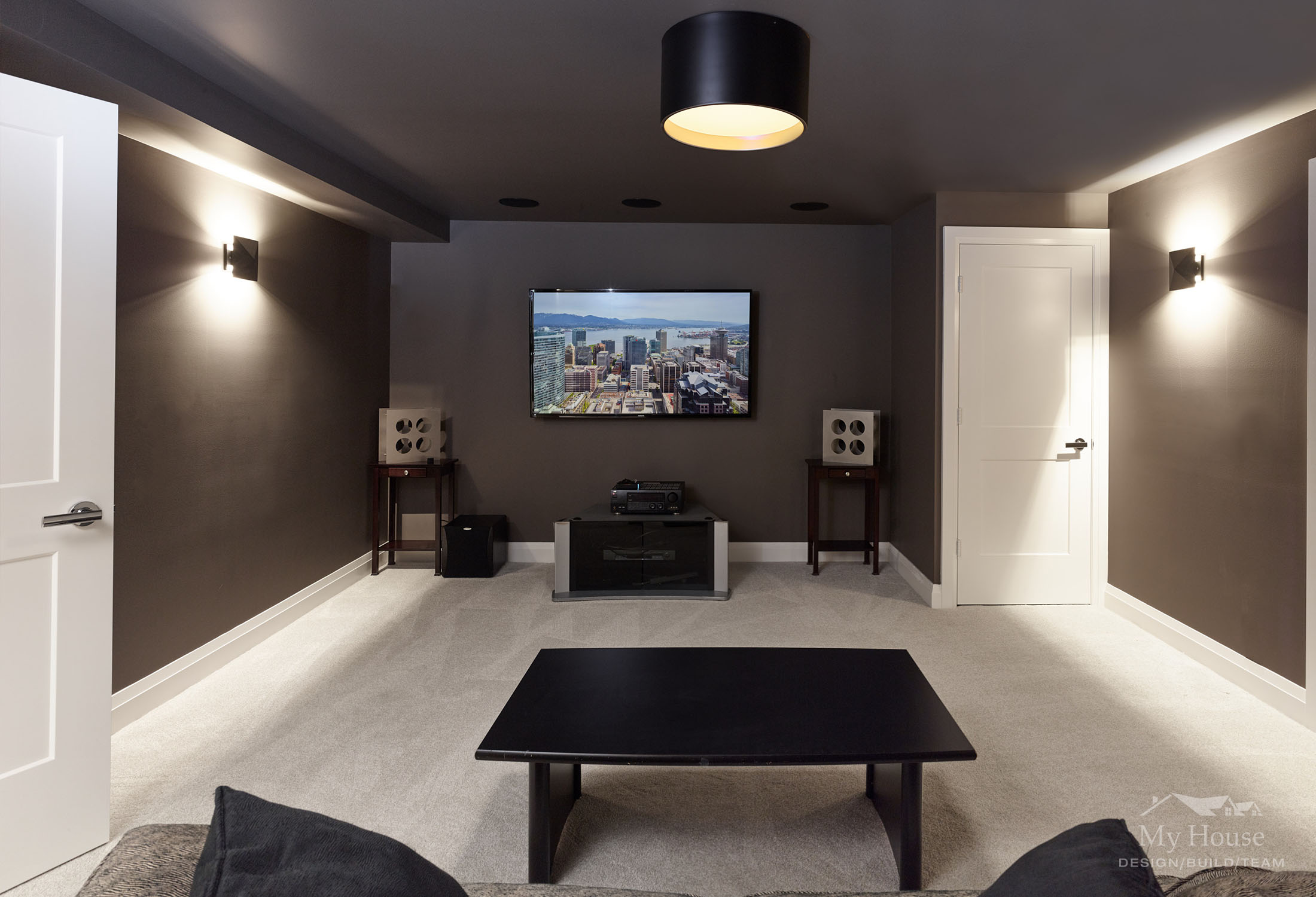
And finally, the basement. A lot of this space was already intact, but we installed new vinyl plank flooring in the rec room and gave everything a fresh coat of paint. We took one of the rooms and created a home theatre for him.
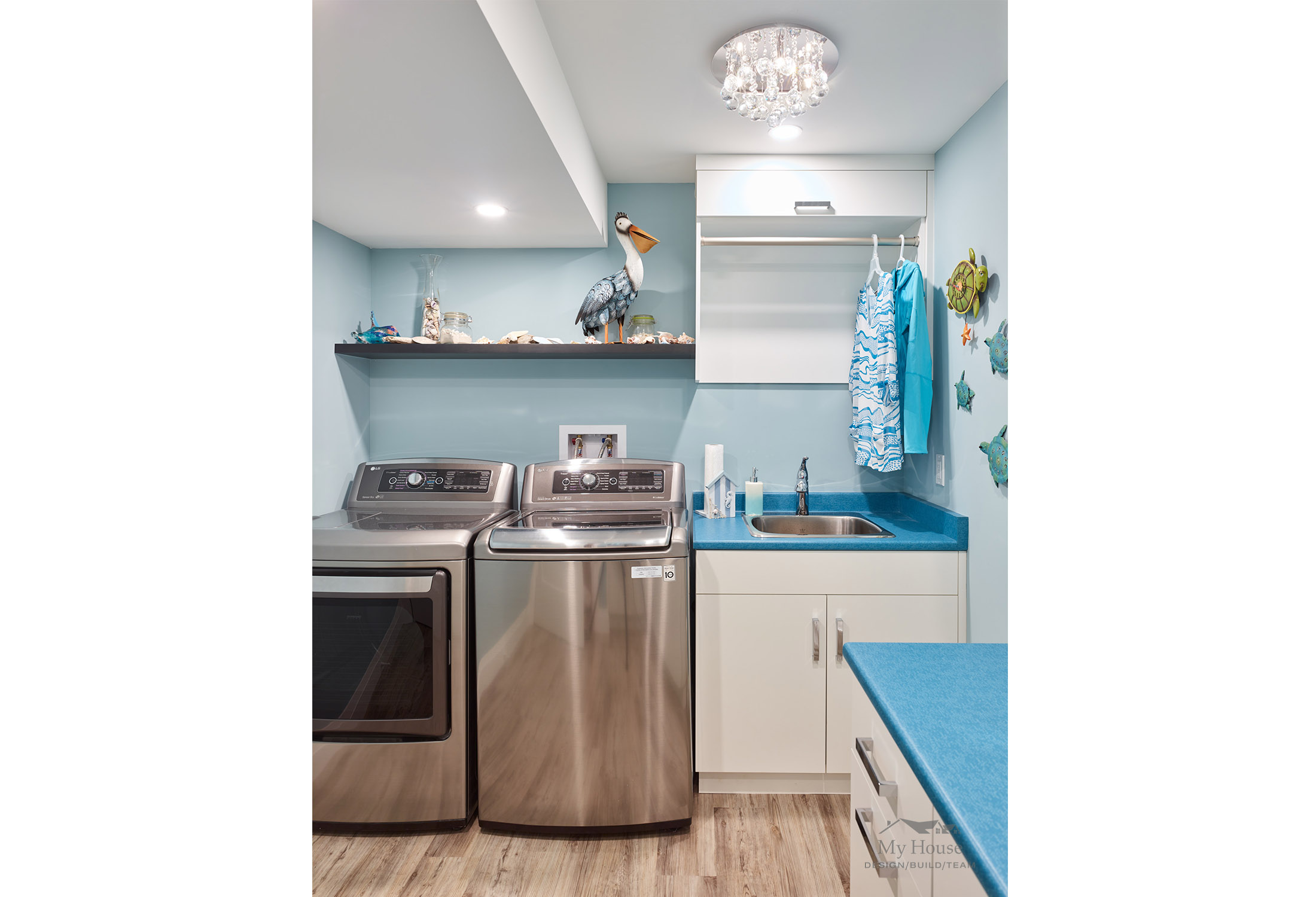
We also re-vamped and brightened up the laundry room for her, complete with a crystal chandelier and laundry chute from the linen cabinetry upstairs. As she said, “If I’m going to spend half of my life doing laundry, I at least want to enjoy it”, and we couldn’t agree more.
View the photo gallery with before photos on our website.
View the photo gallery of the entire home on Houzz.
This guest post was written by:

Morgan Weldrick
My House Interior Designer

