Burnaby Sweet As Honey
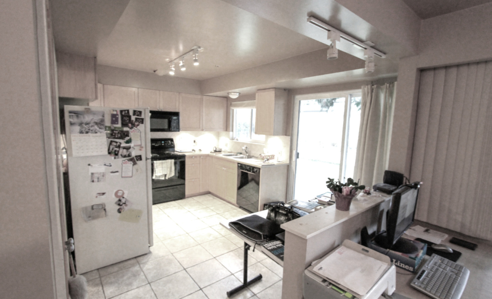
The homeowners in this Burnaby kitchen renovation didn’t want to move and knew their home needed major upgrades. They particularly didn’t like their dark, cramped, dysfunctional kitchen.
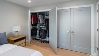
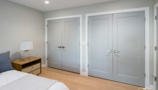
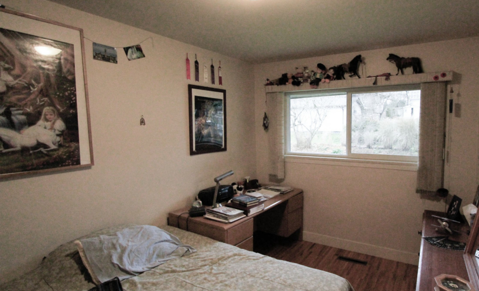
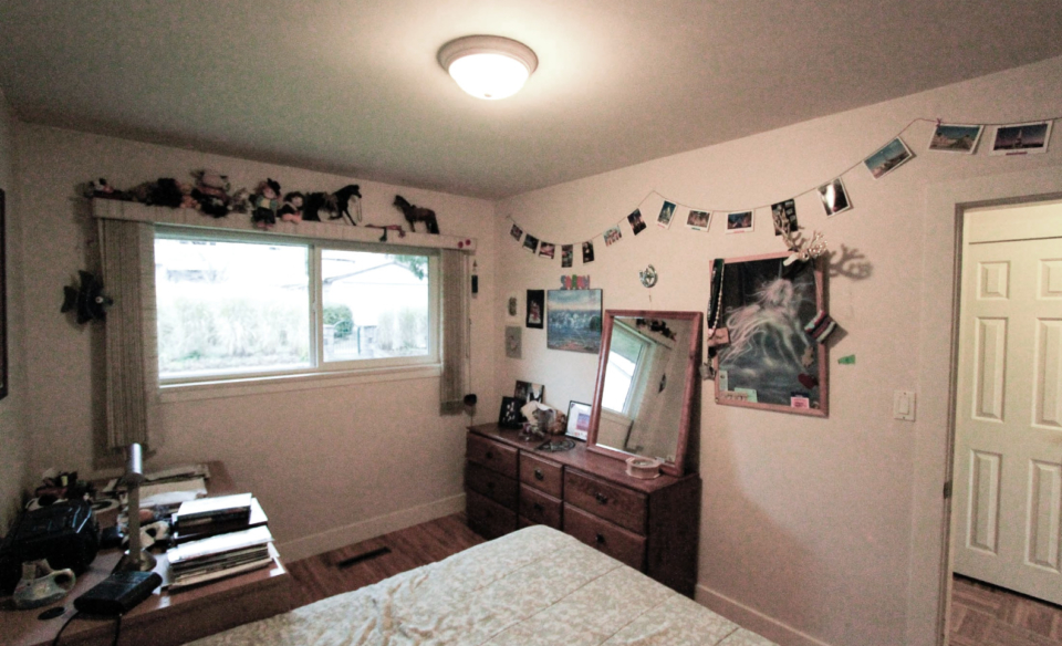
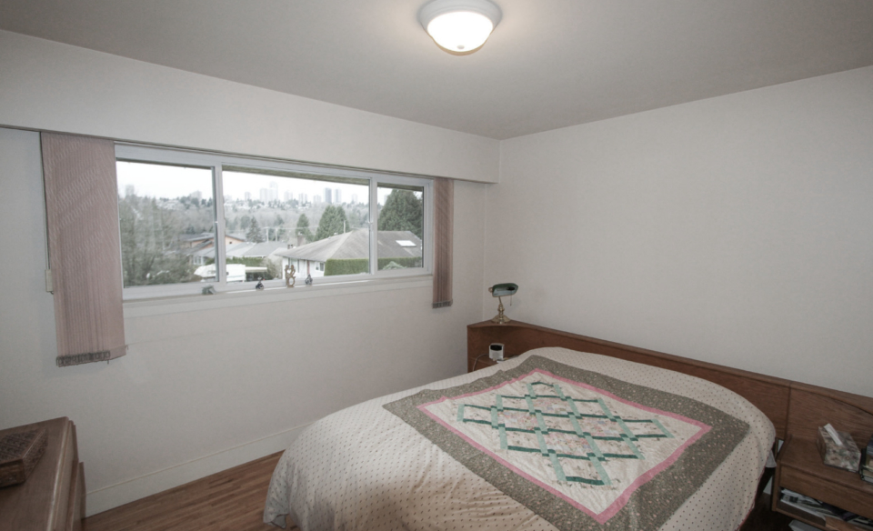
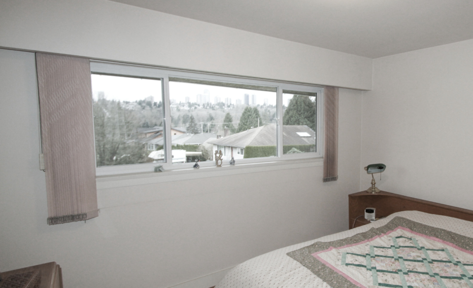
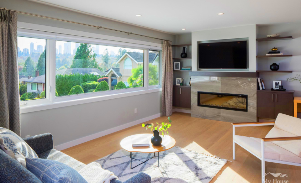
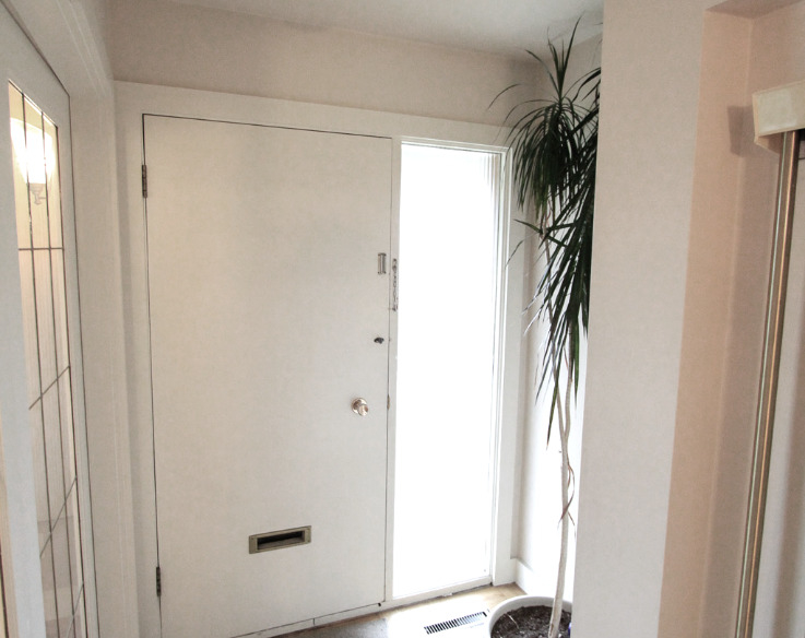
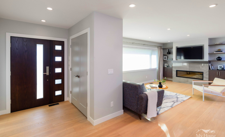
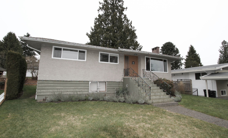
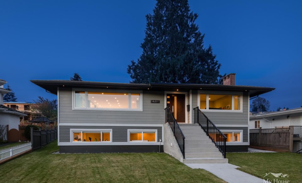
We encourage you to review the before and after photos (found below) to see the extent of the renovation, and where and how the kitchen was transformed.
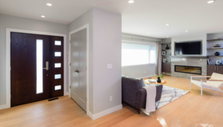
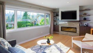
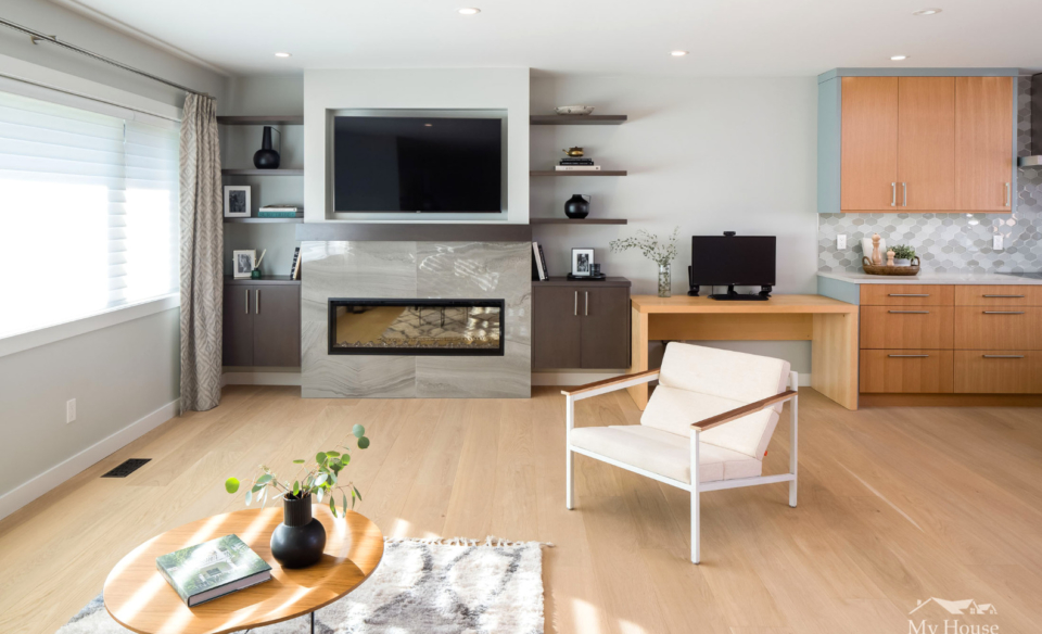
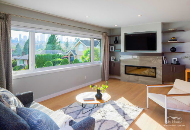
Before the renovation, the kitchen was tucked away in a dark alcove. Natural light and views were in the front of the home where less time was spent. We decided to move the kitchen, as this allowed the creation of a light-filled open concept living space with a view.
Relocating a Kitchen During a Renovation
This Burnaby renovation project was truly more than just a kitchen. With homeowners living in the basement during the project, the entire main floor was reconfigured.
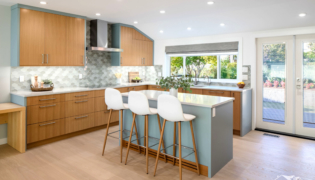
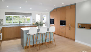
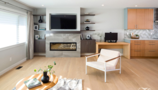
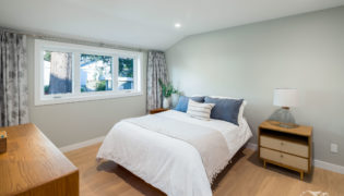
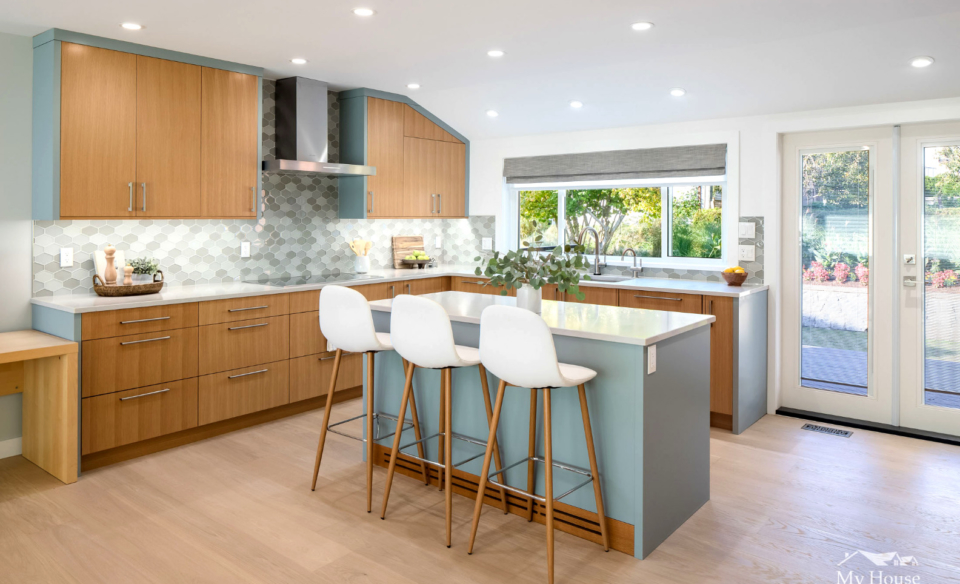
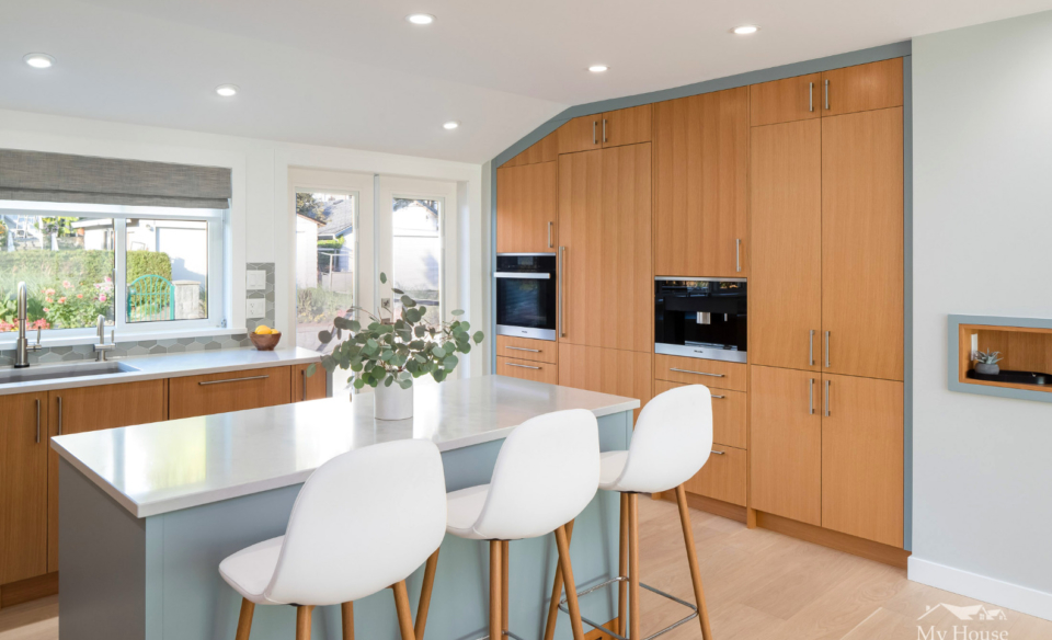
The kitchen moved from the middle of the house to the side. Engineered wide-plank brushed oak flooring was used throughout the main floor. This was the “honey” colour that inspired the project title. (see below for some incredible before and after photos)
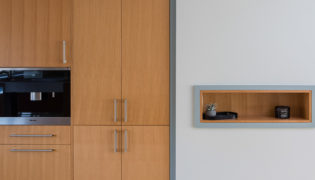
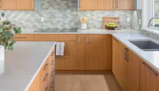
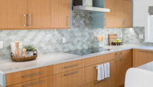
The cramped kitchen became L-shaped, with a better working triangle, and more storage and counterspace. New flat panel cabinets in vertical grain white oak replaced old. Parts of the kitchen island and cabinet trim were painted a classic Piedmont Gray. A subtle grey hexagonal-shaped mosaic backsplash juxtaposes the vertical lines in the cabinets. Caesarstone quartz countertop with square edges completes the look.
The new kitchen island hosts seating for three, and can be extended for larger group.
Before and After
Move the slider across the image to see the before and after of various rooms in the house.
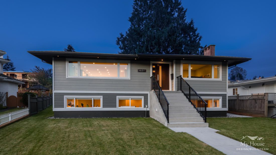
Follow this project through its amazing transformation. Because of the large scale changes, our camera angles may shift from before to after.
Structural Changes, Adding Natural Light
As part of their original requests, the homeowners wanted more natural light. This was achieved by swapping the kitchen and living space, and adding a kitchen window.
An additional interesting thing about this home is its trapezoid shape. It is 1.5 feet wider at front than back. This created challenges in framing and internal finishing. The home was also sloped a bit to the left, which required new secondary beams and framing to fix floors and walls.
New Living Space, Suited to Lifestyle
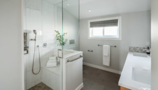
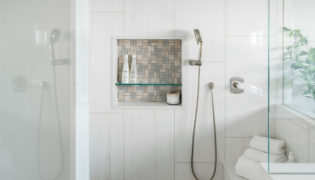
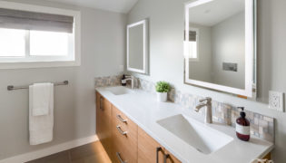
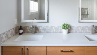
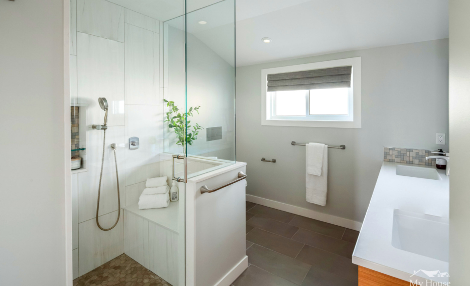
The small outdated bathroom with an under-utilized tub became a modern space with a generous sized walk-in shower and vanity with two sinks. Floating cabinetry and a wall hung toilet gives the illusion of more space. To find out how the My House Design/Build/Team can help with your Burnaby kitchen renovation, contact us through our free consultation form. Our team can help bring your renovation dreams to reality.
