Renovations
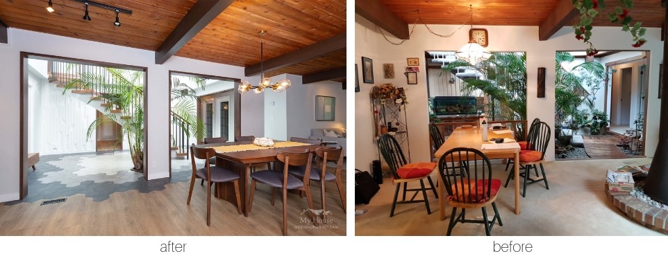
Mid-Century Revival – A Coquitlam Renovation
Right from the beginning it was evident that this Coquitlam Renovation was unique. It’s first impression was memorable as immediately after entering the front door, just past the dining table, there was a tree growing in the middle of home! Upon further inspection of the space it became apparent that this home had undergone several alterations during its lifetime. Especially in the atrium, there was exterior siding, stucco, dirt floor, exterior light fixtures, and openings. Clearly the previous owners had added a roof over an exterior courtyard to capture the space for interior use. Removing the dirt floors and spider webs was a very high priority for these clients.
Read more to learn about this Coquitlam Renovation.
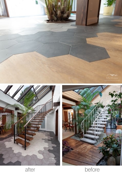
We knew we wanted to transform this central space to be the focal point. The home’s design became based around the atrium and its tile ‘splash’. Other materials in this space that add to this effect are the 3D angular mouldings which flow from the glass ceiling to the floor. As well as the colour variation in the hexagon tile, radiating from light in the center to dark around the perimeter. These high contrast tiles not only draw your eye to the center of the atrium but the flush transition between the tiles and hardwood help connect the atrium with the rest of the home. Find more about Temecula heating service here.
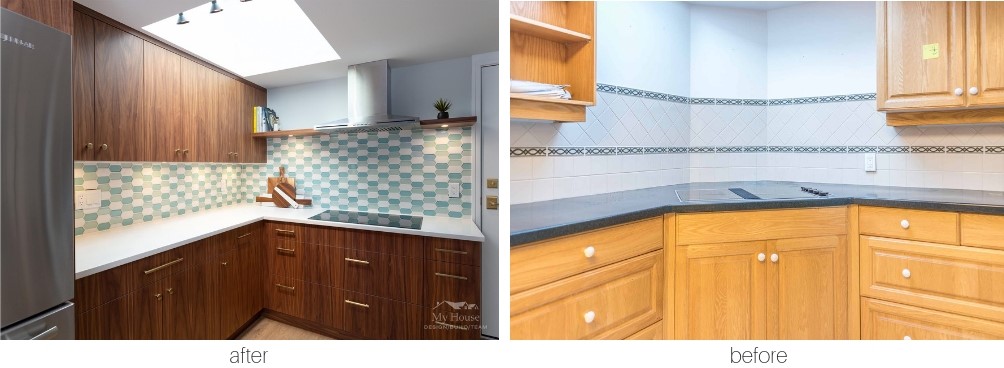
The kitchen was once a space that revealed the home’s layered history. It was evident there had been an addition as the dropped ceiling exposed where garage space had been captured to become part of the kitchen. By re-configuring the layout, we were able to create a gathering area at the peninsula, additional storage space, as well as add a hood fan – something the original space was lacking, visit https://boofurniture.com. Details like the Grand Canal paint colour from Sherwin Williams paired with the vertical grain walnut cabinets create a modern-vintage feel for this kitchen.
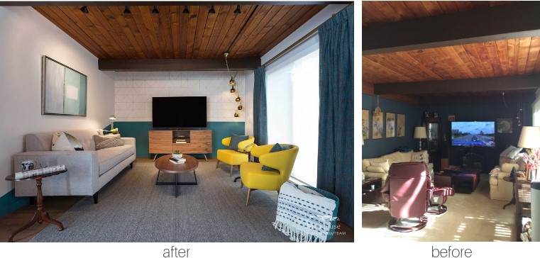
The homeowners unabashedness towards colour and willingness to embrace the home’s mid-century architecture made this home one of a kind. The existing T&G cedar ceiling, dropped beams, and ample glazing naturally leant itself to a mid-century space.
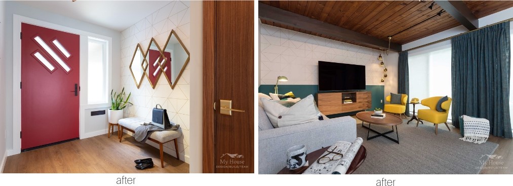
Additional details like the geometric wall paper in the foyer, the vintage light fixture in the living room, and the bold drapery help to tie everything together to create a cohesive mid-century modern feel throughout the entire home.
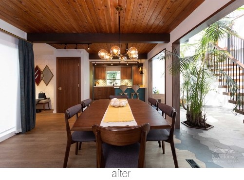
A home that was once pieced together now flows seamlessly from one space to the next. This home is a direct reflection of the homeowner’s vivid personality. There are so many details that can be the topic of conversation and we are so happy we had the opportunity to work with these clients.
View the photo gallery with before photos on our website.
Watch the video home tour on Youtube.
This guest post was written by:

Rebecca Runacres
My House Interior Designer
